


With the whole world making the move toward digital, scientific and medical communication has also revolutionized to suit the changing needs of stakeholders and the broader audience. Scientists have been making use of social media platforms such as Twitter and YouTube to promote their research and ideas using visual abstracts as visual content is becoming increasingly popular in these busy times.
What’s the trend in pharma?
Pharma is embracing creative and innovative strategies for publication planning and marketing. With limited time and opportunities to meet, healthcare professionals (HCPs), medical science liaisons (MSLs), and key opinion leaders (KOLs) depend mostly on conference calls and emails for sharing scientific and clinical data and product information. According to José Antonio Burón Vidal (Regional Medical Head, Europe, Novartis), HCPs nowadays are up to their necks in the deluge of digital information. So, they want MSLs to answer questions like “Can you help me to make sense of all of these data? Can you help me to integrate the 20 publications that I’ve seen? Can you help me to connect this with my patient needs and outcomes?”. Moreover, Judy Kando (VP, Head of Medical and Clinical, Tris Pharma) says, “MSLs report that it’s become more difficult to establish virtual relationships where there is a new KOL or HCP and you have no relationship with them. Particularly now, and for the foreseeable future, these relationships are going to be virtual. It’s been a bit challenging to adapt.” Thus, short, visually appealing, and easily digestible pieces of interactive content are increasingly being used for maximum engagement in the field of healthcare and medical education.
Visual content helps to effectively engage, inform, and educate the target audience by making clinical information easier to understand and making its consumption smoother and more natural. Journals (FEMS Journals, Journal of Experimental Medicine, Cell Press, Elsevier, etc.) are also increasingly requesting visual abstracts as part of the article submission process, and some are also creating them to promote featured and highlighted articles. So, what exactly is a graphical abstract then? Let’s take a look.
What are graphical or visual abstracts?
Graphical or visual abstracts are easily digestible single images that help in quick and concise dissemination of research findings and key outcomes. They can be used as promotional materials on social media, as teaching tools and learning aids, in scientific and medical conferences and public lectures, on webpages, in media releases, and so on. Visual abstracts are not here to replace research papers but are just tools to draw attention to the actual study. First introduced by Dr. Andrew Ibrahim (@AndrewMIbrahim), Institute for Healthcare Policy & Innovation, Department of Surgery, University of Michigan and Creative Editor of Annals of Surgery, this trend—i.e., the way we know graphical or visual abstracts today—began in 2016 on Twitter and has been gaining momentum since. The movement also has its own hashtag “#VisualAbstract”.
According to Dr. Ibrahim, “Journals have a long history of using visual information to summarize key information of an article, such as “The Central Illustration” or the “Graphical table of contents,” dating back to the 1980s. It was often focused on basic science submissions to explain pathways or reaction mechanisms. In the era of social media, it has taken on more of a central role for many journals.”
Many distinguished researchers have also jumped on the bandwagon. For example, Dr. Joel Topf (@kidney_boy), a nephrologist who is widely popular on social media and leads @NephJC, a monthly journal club session held on Twitter, is a fan of visual abstracts. In Dr. Topf’s words, “Messaging is changing from text to images. The fastest growing social networks, Instagram and Snapchat, are entirely based on images. In order to communicate in this new paradigm, science needs to adapt its messaging to speak to this phenomenon. This is how I view visual abstracts. In a post-text society, science is using simple visuals to rapidly and clearly communicate the broad strokes of a scientific study.”
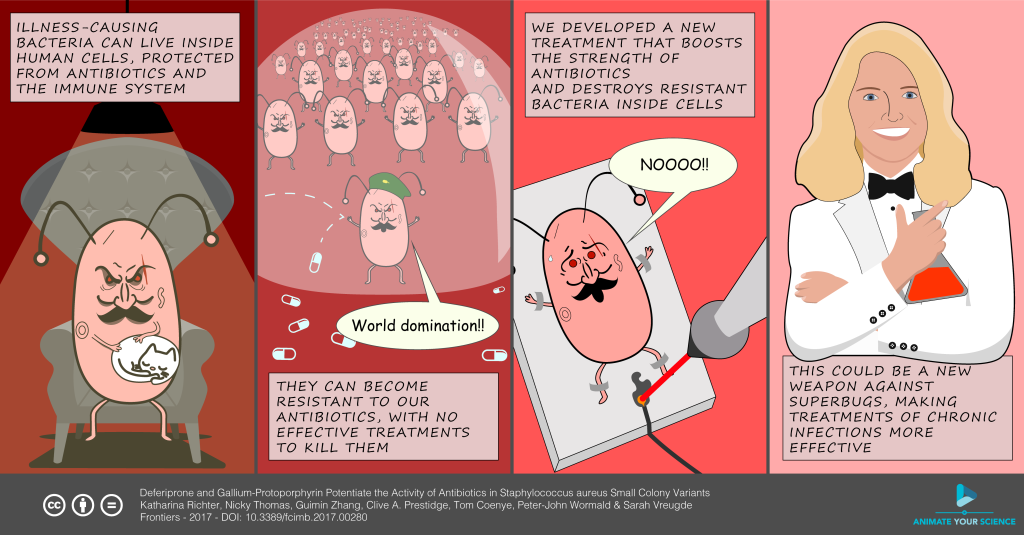
Graphical or visual abstracts allow room for science communication to be reimagined in a range of creative ways, from cartoon strips to more formal and data-heavy infographics.

How effective are visual abstracts?
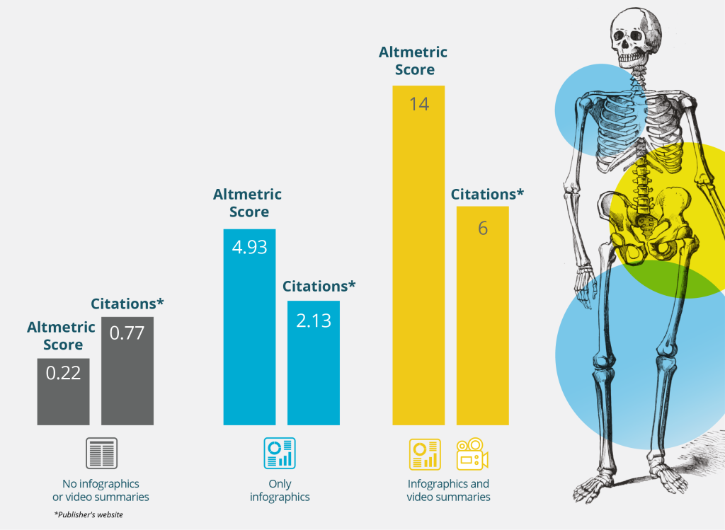
A whitepaper by Cactus Life Sciences’ partner concern Impact Science mentions, “Of all articles published by the Journal of Bone & Joint Surgery in 2020, those with both infographics and video summaries had Altmetric Scores almost 22 times higher than articles with only an infographic, and 63 times higher than articles with neither. Similarly, articles with infographics and video summaries garnered over twice as many citations than those with only infographics and more than seven times as many citations than articles with neither.” See the image below.
Likewise, Annals of Surgery found that tweets that were put out with a visual abstract experienced a 2.7-fold increase in article visits, an 8.4-fold increase in retweets, and a 7.7-fold increase in Twitter impressions.
Twitter is also abuzz with welcoming comments and views about visual abstracts.
How can you get started?
It’s clear that medical affairs and medical communications have a world of opportunities to boost the real-world impact of their publications, and the time is now. Wondering where to start? Contact Cactus Life Sciences at inquiry.lifesciences@cactusglobal.com for help with visual content planning and strategy. By working with us for high-quality digital supplements for your publications, you can ensure that your publications are always among the first to catch the attention of your stakeholders.
Share this post
About the author

Kwisha Shah
Kwisha Shah is Marketing Content Manager, Thought Leadership, at Cactus Life Sciences.